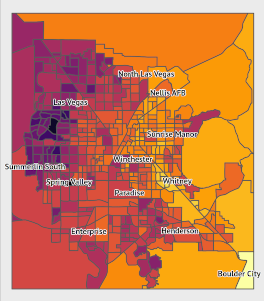
Background For the past several months, I have been working on an analysis on the effects of urban heat on vulnerable populations, particularly during a public health crisis. For some background, I currently live in Las Vegas, where summer heat can exceed 110 degrees. Last summer included a 45-day-long streak of temperatures over 100 degrees.
Urban heat is not distributed evenly within cities. Features such as parks or ponds can lead to cooler temperatures in some areas, while areas without foliage or with dark surfaces such as roads and buildings lead to warmer temperatures.
Note 2: Now that the 2020 Census has concluded, the embedded Shiny app has been shut down. I’ve left the code used to embed the app on the site, and I’ve linked to a blog post with screenshots of the app itself. But the app itself is no longer linked and no longer embedded here. Note: This post was updated on 2020-07-10 with a new version of the Shiny app.
I recently developed an R Shiny app for tracking the daily 2020 census numbers in Nevada.
In this post, we attempt to embed an interactive plot generated using plot_ly in this web page. The plot was generated in R. We are following this guide to embed the interactive figure.
Some context: the figure below depicts the change in enrollment in health insurance through the HealthCare.gov marketplace (the federal marketplace established through the Affordable Care Act) from coverage year 2019 to coverage year 2020. A static version of this figure was made using ggplot.
2020-01-08
2 min read