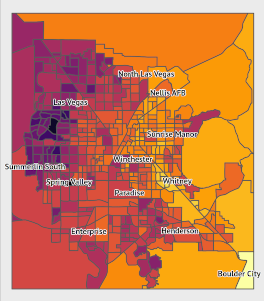
Background For the past several months, I have been working on an analysis on the effects of urban heat on vulnerable populations, particularly during a public health crisis. For some background, I currently live in Las Vegas, where summer heat can exceed 110 degrees. Last summer included a 45-day-long streak of temperatures over 100 degrees.
Urban heat is not distributed evenly within cities. Features such as parks or ponds can lead to cooler temperatures in some areas, while areas without foliage or with dark surfaces such as roads and buildings lead to warmer temperatures.
Note 2: Now that the 2020 Census has concluded, the embedded Shiny app has been shut down. I’ve left the code used to embed the app on the site, and I’ve linked to a blog post with screenshots of the app itself. But the app itself is no longer linked and no longer embedded here. Note: This post was updated on 2020-07-10 with a new version of the Shiny app.
I recently developed an R Shiny app for tracking the daily 2020 census numbers in Nevada.
Contents Table of Contents Contents Introduction Base R Figure in Base R with Default Options High-Resolution Figure with Incorrect Figure Component Dimensions in Base R High-Resolution Figure with Correct Font Sizes in Base R High-resolution figures in ggplot Figure in ggplot2 with default options Figure in ggplot2 with higher resolution Formatted, high-resolution ggplot2 figure Introduction In this post, I go over the process for exporting high-resolution graphics of the desired size with consistent layouts and font sizes.
In this post, we attempt to embed an interactive plot generated using plot_ly in this web page. The plot was generated in R. We are following this guide to embed the interactive figure.
Some context: the figure below depicts the change in enrollment in health insurance through the HealthCare.gov marketplace (the federal marketplace established through the Affordable Care Act) from coverage year 2019 to coverage year 2020. A static version of this figure was made using ggplot.
2020-01-08
2 min read
Introduction This is a followup to a prior post on the same topic, where I used R’s base plotting system to visualize a linear programming provelm. I’m again looking at section 1.4 of Introduction to Linear Optimization. This time, we’ll consider Example 1.8 on page 23 (Bertsimas and Tsitsiklis 1997, 23). The optimization problem in this example is:
\[\begin{align*} -x_1+x_2 &\leq 1 \\ x_1 &\geq 0 \\ x_2 &\geq 0 \end{align*}\]
Some preliminary notes This time, instead of using the base R package, we’re going to plot the problem using the ggplot2 package (Wickham 2009).
Introduction In this post, I outline the basics of setting up and using OpenBUGS on linux. BUGS stands for Bayesian inference Using Gibbs Sampling. OpenBUGS allows for the analysis of highly-complex statistical models using Markov-chain Monte Carlo methods. It is specifically focused on Bayesian methods.
This guide may not be generalizable to all Linux systems, but it worked for me. It wasn’t too difficult, but I did have to pull together a number of different sources to get everything working as intended.
Motivation I’m revisiting my old statistical inference textbook with the aim of slowly working through many of the problems. When I started out, Casella and Berger’s Statistical Inference was my first ever exposure to statistics, and I didn’t have the mathematical preparation for it. Since then, I’ve developed greater mathematical maturity and better general knowledge and intuition about statistics.
I also want to learn how to implement some of the procedures and verify some of the properties in the book using R.
Introduction Today, I’m looking at section 1.4 of Introduction to Linear Optimization. The goal of this section is to find “useful geometric insights into the nature of linear optimization programming problems”. I will recreate the examples from the book in R.
In the following examples, we want to visually examine linear programming problems in order to:
See what the objective function being optimized looks like Visualize the feasible set based on the given constraints If possible, visually identify solution.